Using the Chart View

Using the Chart view is especially useful to visualize data. And not only to see them. In some types of charts in Lumeer, you can actually update the values by a drag of a mouse.
Available Types of Charts
When creating a chart, you can pick one from the following in the first dropdown in chart settings:
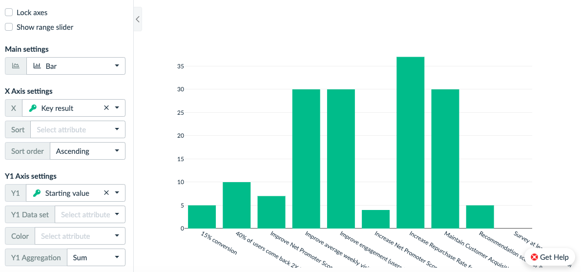
- Bar chart
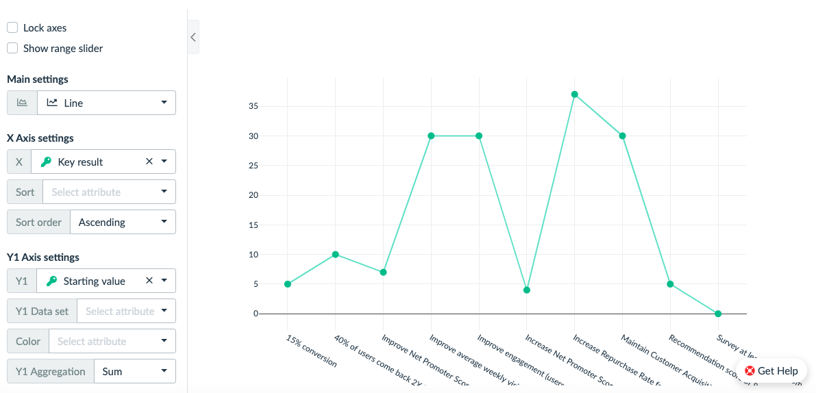
- Line chart
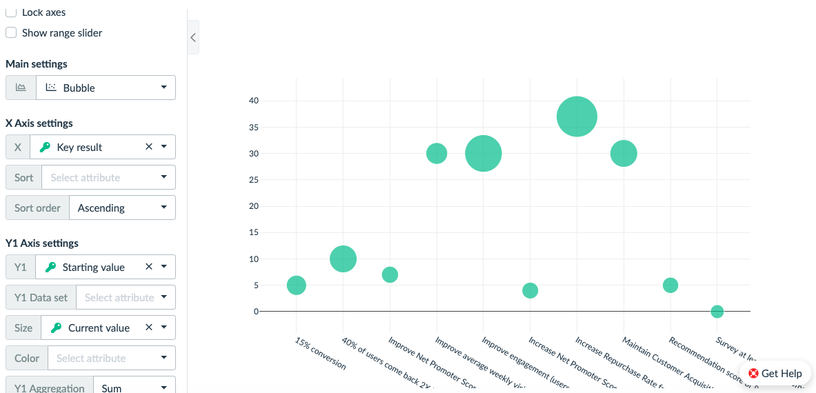
- Bubble chart
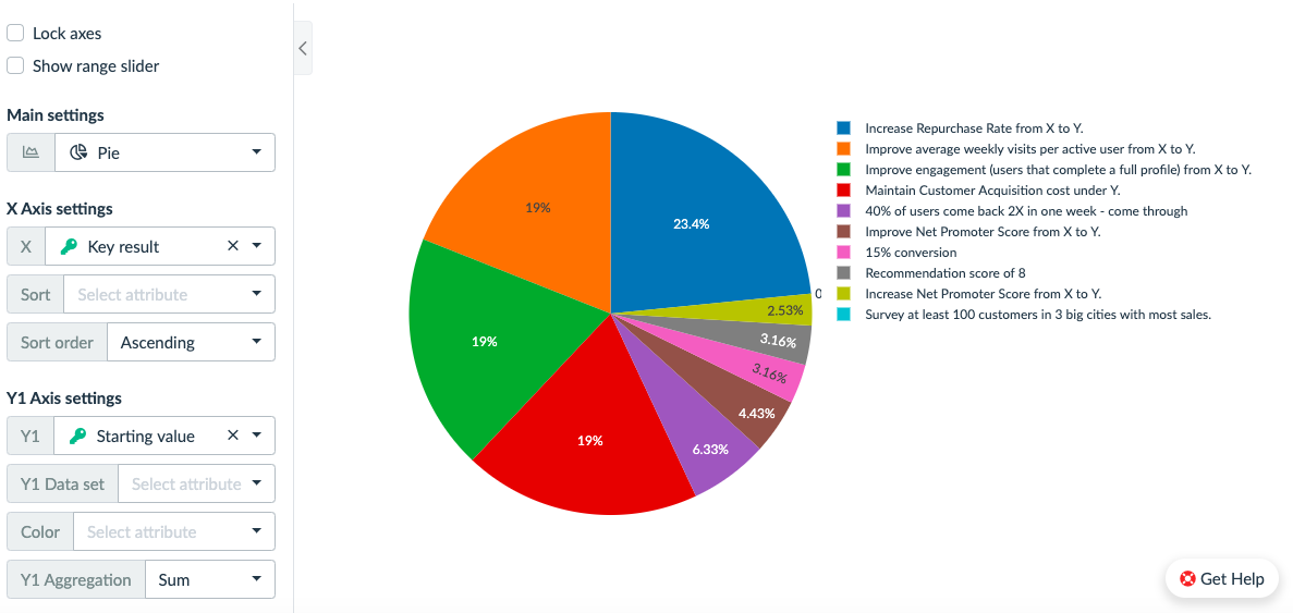
- Pie chart
Configuring the dataset
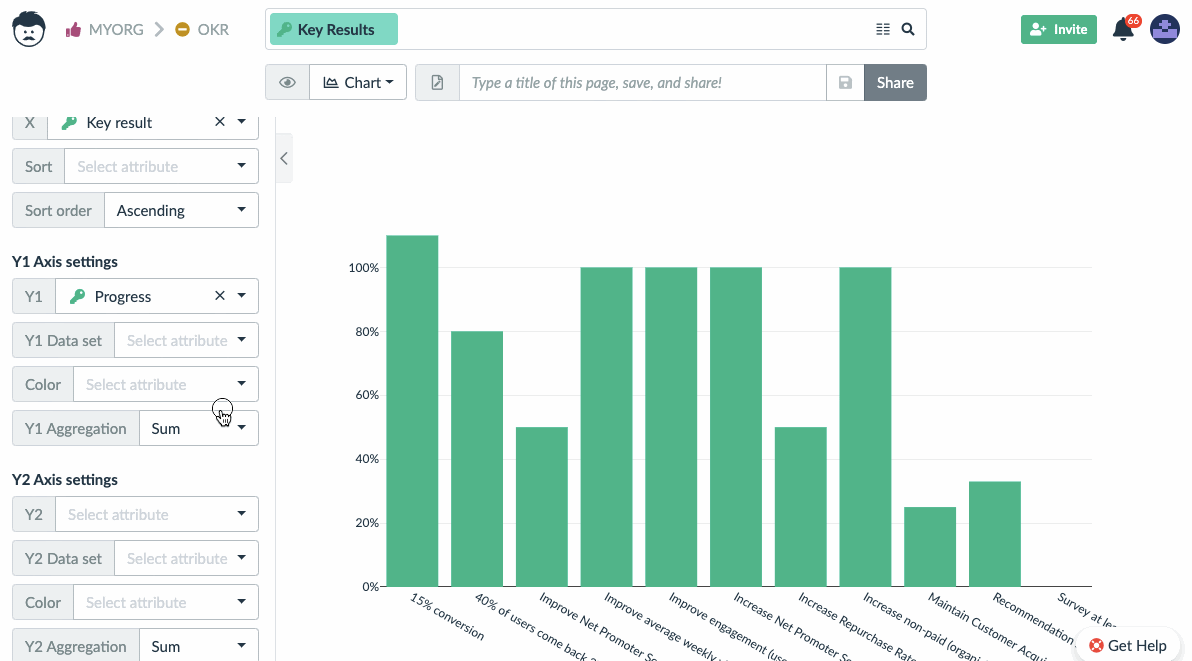
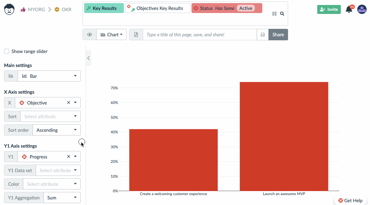
Using the Chart view is straight forward. You can start by choosing which attributes are going to be displayed on the X and Y1 axes.
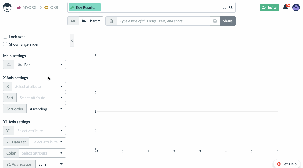
It’s also possible to set up the second Y2 axis.
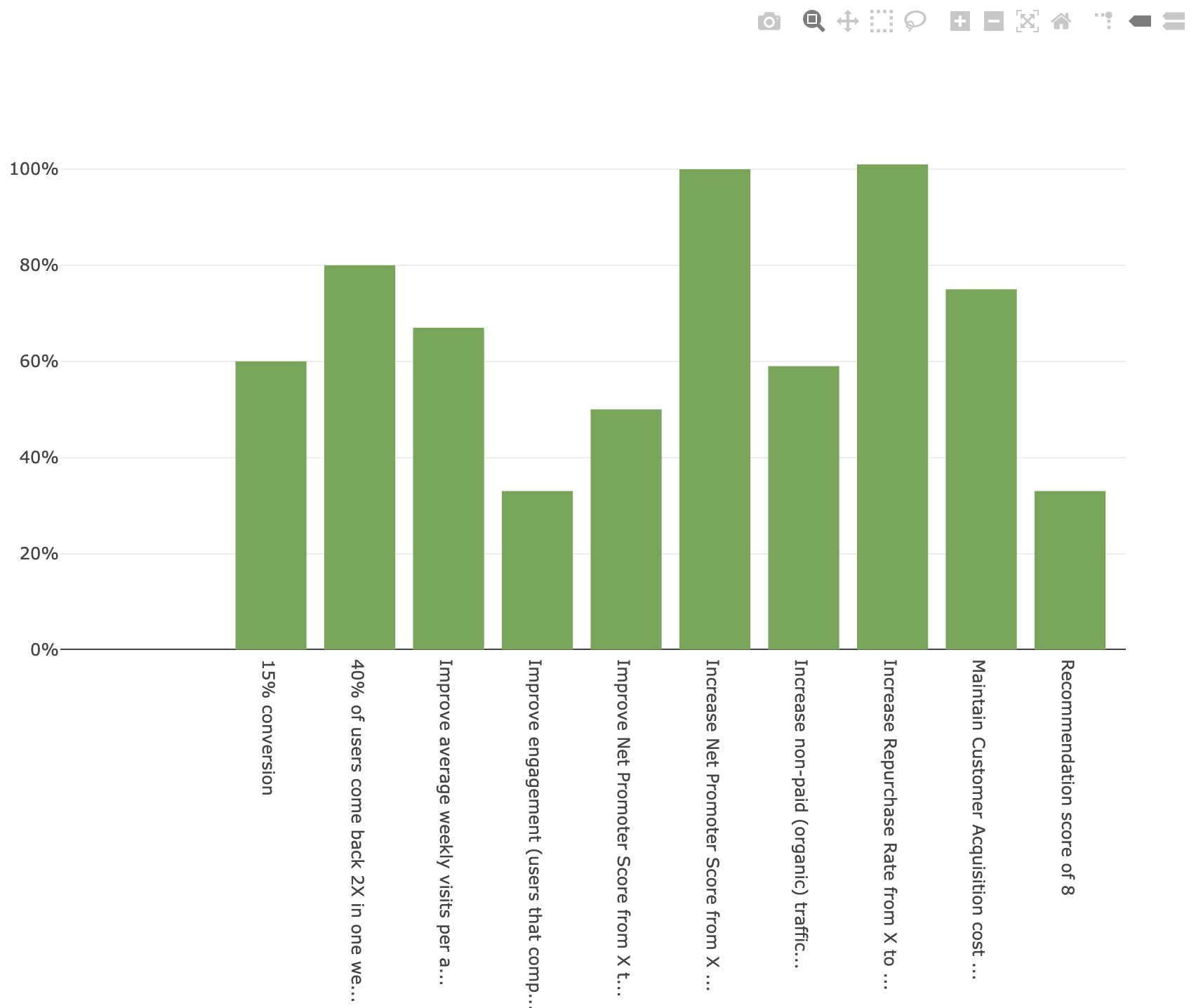
The chart allows a wide variety of visual manipulation with the chart image itself. Both axes can be shifted by dragging them (see when mouse cursor changes to double arrow when hovering over the axis).
Axes can be also scaled – just try to hover the mouse cursor near the end of either of the axes until it changes to a single arrow. Then drag the mouse to change the scale.
You can also select a region of the chart, or save it as a PNG image. There is always the home button to reset its state.
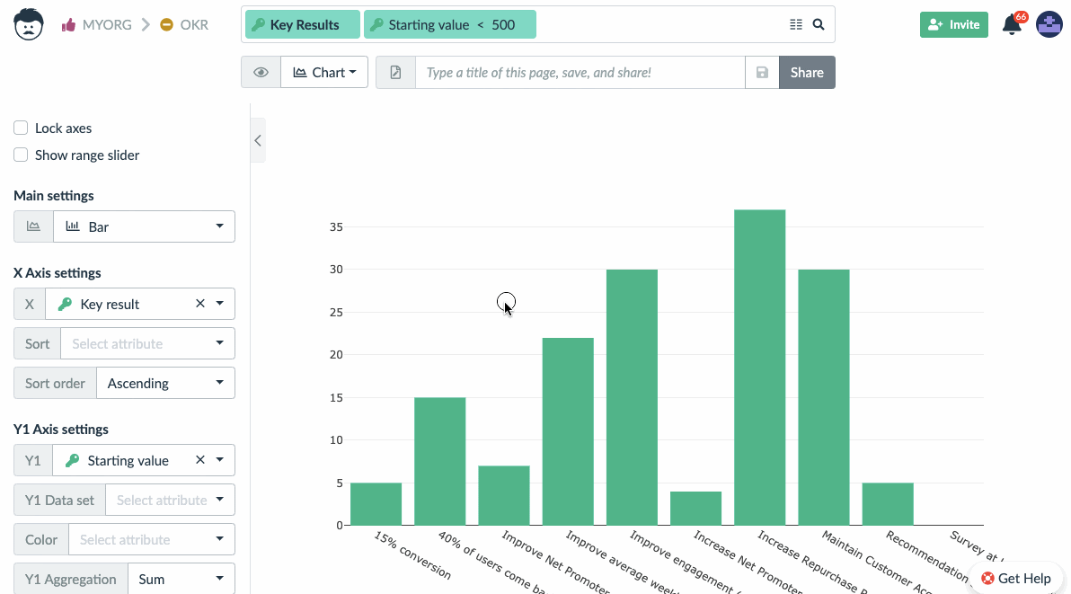
Sometimes it’s useful not to display the value of the record itself, but the values of the linked records (see the Table view to read more about table links). Fortunately, this is very easy using the Chart view.
For example, instead of displaying progress for the objective, you might want to see progress of all of its key results. Therefore we set up the Key result as a Y1 dataset.
Using the Chart View to Work with Your Data
You don’t need to go back to a table if you need to change the displayed data. Just drag the values in the chart and they will be automatically updated. This is currently supported in the bar and line chart.
Note: It’s not possible to manipulate values in columns which have their values calculated by a function or a rule. Simply because there is no way to figure out, which of the original values that contribute to the column value, should be changed.
Bubble Chart to Display Team Throughput or Load
The bubble chart has the ability to display one more visual variable. These are:
- X axis position
- Y axis position
- color
- size
The size of the bubble is useful to display load of team members on individual projects or sprints (e.g. the amount of work assigned to them in the given time frame).
The recommended settings is to choose the assignee for the Y1 axis, project name on the X axis, and spent time or estimated time for bubble size. Time can be further limited in the search bar.
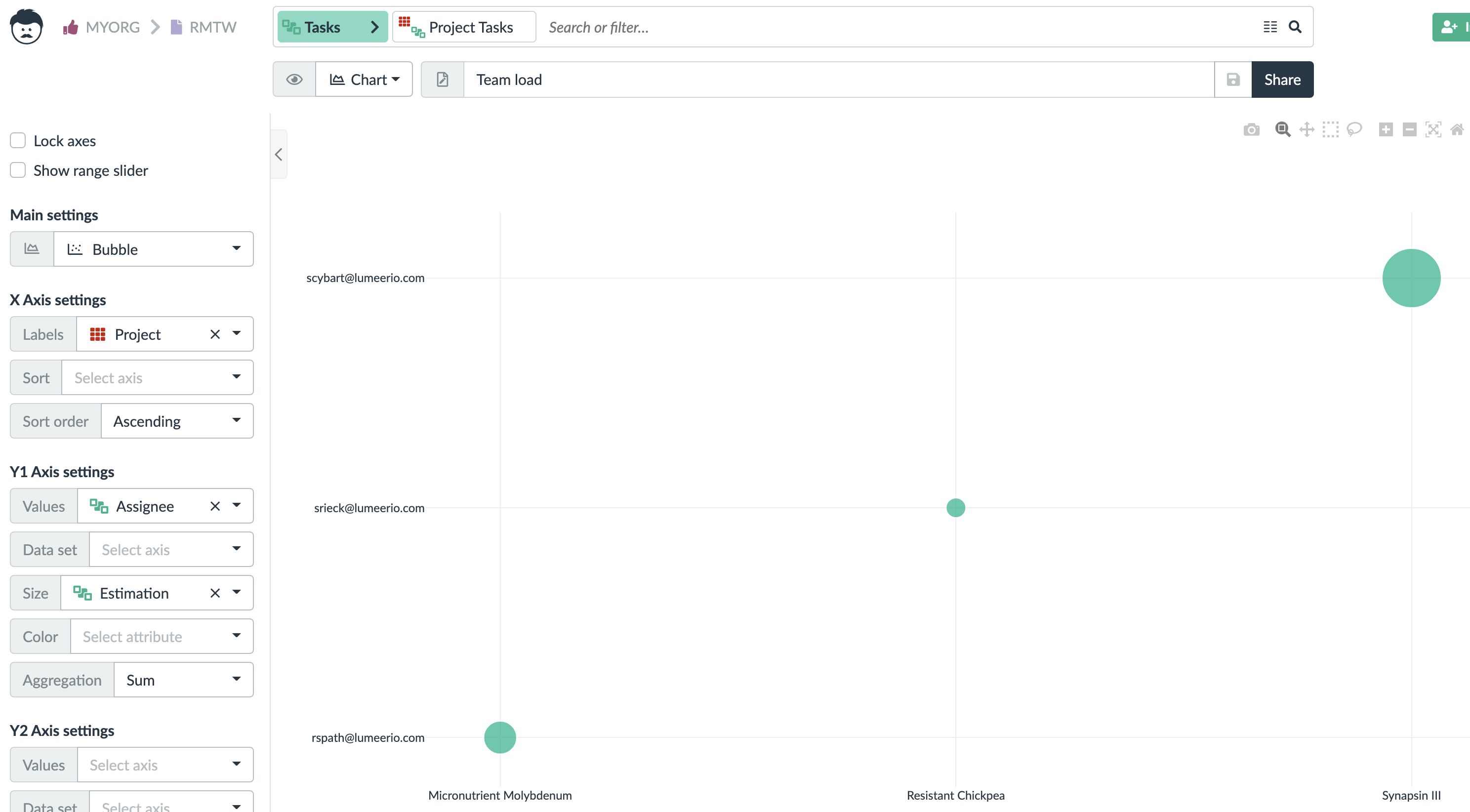
Please note that the search bar has tasks and link to projects selected for us to be able to work with attributes from both tables at once.
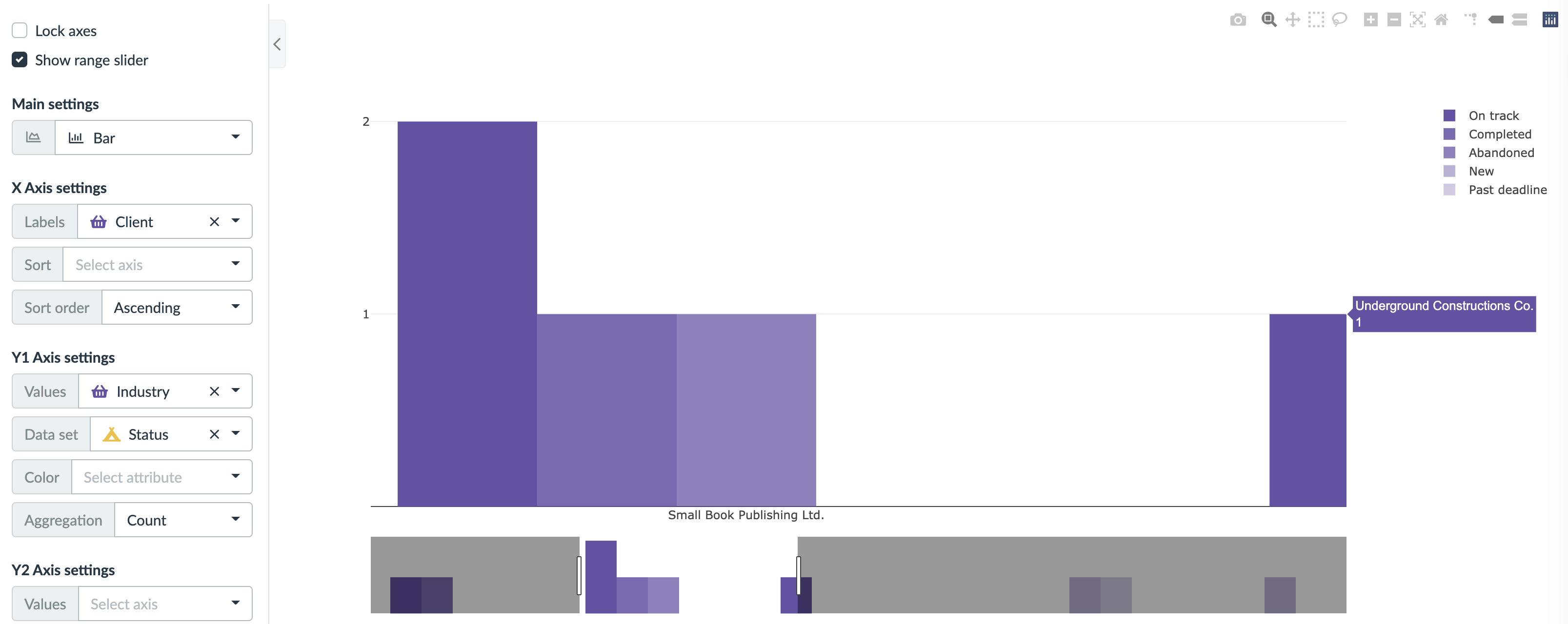
Range Slider
A range slider is a tool that can be displayed under the main chart and allows a comfortable way of selecting a smaller window of the X axis. You might know this from stock exchange charts.
It gets activated by the Show range slider checkbox at the top of the view settings panel.
We keep adding new chart types based on user demands. If you have any specific needs, please get in touch with us.