What is a Pivot Table and how to create it: complete guide for 2022 (from beginners to advanced with real world examples)
")
Our aim is to provide you with the simplest introduction and the easiest explanation of what is a Pivot Table that you can find.
After reading this article, you will understand the principles of pivot tables. You will know how they work under the hood. You will also learn how to analyse your business data.
If you have never created a pivot table, or you can create them but it feels like magic to you, this is the right article for you.
Even if you are an everyday user of the pivot tables, you can gain a deeper knowledge of their inner workings.
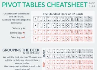
Pivot Tables Cheatsheet
Pivot Table Examples: An Ultimate Collection of 62 Use Cases for 2022 That Make You Excel in Your Job

What is a Pivot Table and how does it work?
A Pivot Table is one of the basic data analysis tools. Pivot Tables can quickly answer many important business questions.
One of the reasons we build Pivot Tables is to pass information. We would like to support our story with data that is easy to understand, easy to see.
Although Pivot Tables are only tables and thus missing real visuals, they can still be considered as a mean of Visual Storytelling.
Want to Try Pivot Tables First?
For you to get a better understanding of what we discuss, feel free to play with the pivot tables first. Then you can continue reading.
Hint: More examples can be accessed by using the link < Home.
How to master Pivot Tables?
Pivot tables’ mastery might seem rather hard. However, with a few basic principles, you can understand it very well. You can easily get up to speed with your colleagues who are more advanced in this area.
And of course you will bring your value on the job market a bit higher.
How does a Pivot Table work? The rest of this guide will explain that to you step by step using concepts that are familiar to you…
Why do we need pivot?
What is the use of a Pivot Table?
A Pivot Table is used to summarise, sort, reorganise, group, count, total or average data stored in a table. It allows us to transform columns into rows and rows into columns. It allows grouping by any field (column), and using advanced calculations on them.
You can find some more technical detail in various articles on the web like https://www.kohezion.com/blog/what-is-a-pivot-table-examples-and-uses/.
However, such an explanation might raise more questions than answers.
There are more prosaic reasons.
What are the practical examples of a Pivot Table?
Use a pivot table to build a list of unique values. Because pivot tables summarize data, they can be used to find unique values in a table column. This is a good way to quickly see all the values that appear in a field and also find typos, and other inconsistencies. [https://exceljet.net/pivot-table-tips]
More simple explanation is that a pivot table can:
- group items/records/rows into categories
- count the number of items in each category,
- sum the items value
- or compute average, find minimal or maximal value etc.
In a few easy steps, we will see how pivot tables work. Then, no pivot table creating will seem hard anymore.
Let’s start with an example. We will use something we all know very well…
The Standard deck of 52-cards
🂡🂢🂣🂤🂥🂦🂧🂨🂩🂪🂫🂭🂮
🂱🂲🂳🂴🂵🂶🂷🂸🂹🂺🂻🂽🂾
🃁🃂🃃🃄🃅🃆🃇🃈🃉🃊🃋🃍🃎
🃑🃒🃓🃔🃕🃖🃗🃘🃙🃚🃛🃝🃞
Each of the cards has a symbol (clubs ♣, diamonds ♦, hearts ♥, spades ♠), value (A, 1 through 10, J, Q K) and a color (black or red).
Let’s group the deck by colour:
| black | 🂡🂢🂣🂤🂥🂦🂧🂨🂩🂪🂫🂭🂮 🃑🃒🃓🃔🃕🃖🃗🃘🃙🃚🃛🃝🃞 |
| red | 🂱🂲🂳🂴🂵🂶🂷🂸🂹🂺🂻🂽🂾 🃁🃂🃃🃄🃅🃆🃇🃈🃉🃊🃋🃍🃎 |
We have put the cards into two categories, or into two new decks if you will.
What information can we get out of this table? We can count the cards in each of the categories for example.
Instead of counting all the cards in a specific table cell, the computer can do the counting for us. As a result, we only see the number.
| black | 26 |
| red | 26 |
Now we know that there is an equal number of black and red cards in the standard deck of 52.
In the first column, we can see the labels black and red. These are called Row Labels.
Isn’t it a bit confusing? Row Labels in a column? Yes, because every row needs its label at the beginning. This renders the labels to be one below another, hence form a column. Don’t get confused by that.
A Row Label starts the row.
What if we turned the table 90 degrees clockwise?
| black | red |
| 26 | 26 |
Not much has changed, right? It provides us the same information. It is just up to our preference which form we like more.
One difference is that we no longer have Row Labels. Instead, we have Column Labels.
Column Labels still refer to the colors red and black. It is just the fact that they now label each of the columns.
As with Row labels, Column Labels are placed at the beginning of the columns and they happen to be one next to each other – thus forming a row.
For an easy understanding, you can have a look at the Pivot Table areas diagram at Excel Campus.
Adding another dimension
Except for colors, what other categories are there for the standard deck of 52?
There are, for example symbols (clubs ♣, diamonds ♦, hearts ♥, spades ♠). So we can sort into groups according to the symbol.
| clubs ♣ | 🃑🃒🃓🃔🃕🃖🃗🃘🃙🃚🃛🃝🃞 |
| diamonds ♦ | 🃁🃂🃃🃄🃅🃆🃇🃈🃉🃊🃋🃍🃎 |
| hearts ♥ | 🂱🂲🂳🂴🂵🂶🂷🂸🂹🂺🂻🂽🂾 |
| spades ♠ | 🂡🂢🂣🂤🂥🂦🂧🂨🂩🂪🂫🂭🂮 |
Again, we can ask the computer to count the cards for us.
| clubs ♣ | 13 |
| diamonds ♦ | 13 |
| hearts ♥ | 13 |
| spades ♠ | 13 |
What if we wanted to divide the cards into more categories using more of their properties (i.e. attributes)? Let’s combine the previous two ways. We will add another dimension that represents the color.
The card symbols now represent Row Labels. We will add the color as Column Labels.
| red | black | |
| clubs ♣ | 🃑🃒🃓🃔🃕🃖🃗🃘🃙🃚🃛🃝🃞 | |
| diamonds ♦ | 🃁🃂🃃🃄🃅🃆🃇🃈🃉🃊🃋🃍🃎 | |
| hearts ♥ | 🂱🂲🂳🂴🂵🂶🂷🂸🂹🂺🂻🂽🂾 | |
| spades ♠ | 🂡🂢🂣🂤🂥🂦🂧🂨🂩🂪🂫🂭🂮 |
Read the results
As you can see, there are categories where there are no cards. This already reveals some useful information.
If it wasn’t for cards that we are all very familiar with, the table tells us that there are no red clubs, no black diamonds, no black hearts and no red spades.
In other words, diamonds and hearts are always red and clubs and spades are always black.
This is our first practical use of the pivot table.
Rotation, juggling and more…
Let’s turn the cards into their counts again.
| red | black | |
| clubs ♣ | 13 | |
| diamonds ♦ | 13 | |
| hearts ♥ | 13 | |
| spades ♠ | 13 |
Let’s see different rotations and variants of using the Row and Column Labels.
Again, it provides the same value, the same information. It just depends on what best represents the story we want to communicate.
- Rotation
| clubs ♣ | diamonds ♦ | hearts ♥ | spades ♠ | |
| black | 13 | 13 | ||
| red | 13 | 13 |
- Multi-level Row Labels
| black | clubs ♣ | 13 |
| diamonds ♦ | ||
| hearts ♥ | ||
| spades ♠ | 13 | |
| red | clubs ♣ | |
| diamonds ♦ | 13 | |
| hearts ♥ | 13 | |
| spades ♠ |
- Multi-level Column Labels
| red | black | ||||||
| clubs ♣ | diamonds ♦ | hearts ♥ | spades ♠ | clubs ♣ | diamonds ♦ | hearts ♥ | spades ♠ |
| 13 | 13 | 13 | 13 | ||||
The second and third cases might seem a bit complicated at first sight. Just imagine that we first divide the cards into the categories according to their color. Next we divide the cards into 4 and 4 categories according to the symbol.
We can also switch the order of Column and Row Labels. For example:
| clubs ♣ | diamonds ♦ | hearts ♥ | spades ♠ | ||||
| red | black | red | black | red | black | red | black |
| 13 | 13 | 13 | 13 | ||||
In the case of the standard deck of 52, such a division in the categories is not very practical. It makes a lot of table cells to remain empty.
For simplicity, most of the tools simply skip the empty cells. Skipping the cells provides a more compressed result that is easier to read.
| black | clubs ♣ | 13 |
| spades ♠ | 13 | |
| red | diamonds ♦ | 13 |
| hearts ♥ | 13 |
Sums and percentages
Count of the totals in rows and columns can sometimes reveal another important information. Probably not in the case of the cards. Although, just have a look…
| red | black | Row Total | |
| clubs ♣ | 13 | 13 | |
| diamonds ♦ | 13 | 13 | |
| hearts ♥ | 13 | 13 | |
| spades ♠ | 13 | 13 | |
| Column Total | 26 | 26 | 52 |
We can see that there are 26 red cards in total, 26 black cards in total and 13 cards with each of the symbols.
It is important to notice that Column Totals count all the cards (52) as well as Row Totals (52).
This is because columns and rows represent different types of categories.
Have you noticed how beautiful the pivot table is?
All the cards are divided in the cells of the pivot table. Every single card is represented exactly once.
This resembles the real world – you cannot put a single card into two decks at the same time.
We might be interested more in the relative values. That means how big a piece of the total number does each column or row represents.
| red | black | Row Total | |
| clubs ♣ | 13 | 25% | |
| diamonds ♦ | 13 | 25% | |
| hearts ♥ | 13 | 25% | |
| spades ♠ | 13 | 25% | |
| Column Total | 50% | 50% | 100% |
As we can see, half of the cards are red, half of them are black. The individual symbols are always represented by a quarter of all the cards.
Let’s pivot and get some pizza
We now know how to put the cards into categories and how we can organise them in a pivot table.
Let’s have a look at a slightly more complex example. We have a receipt from our favorite restaurant.
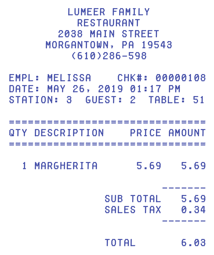
This is a bit similar to a card. Except for the fact that it has more properties.
A receipt does not have symbols and color (assuming bills are mostly blue or black and it does not play any role).
However, there are plenty of new properties on a receipt. The value (i.e. total) remained, although with a different meaning.
What are some other interesting properties on a receipt? These are:
- Employee serving the table
- date and time of the transaction
- goods sold (e.g. pizza Margherita)
- price, tax, total…
There are many more properties on the receipt like restaurant‘s address and phone, station no., guest no., table no. etc…
However we will skip those additional properties for now as they are not important for our examples.
Also, for the sake of simplicity, we will now assume that there is always only one item sold on each receipt.
Tabularize the world
For the computer to efficiently work with information, they need to have some structured form of data.
This is why we put the descriptions of the world around us into tables. Most typically, a single row in a table describes one thing in the real world.
These can be recipe ingredients, car models, tasks to be accomplished etc.
If we wanted to tabularize our standard deck of 52 we would end up with a table of 52 rows. Each row represents a single card. Something like:
| Value | Symbol | Color |
| A | ♥ | red |
| 1 | ♥ | red |
| 2 | ♥ | red |
| … | … | … |
Let’s put the pizza receipt into a table. We will track only the properties highlighted in red.
The resulting table carries four attributes, each in a separate column:
| Employee | Date and Time | Pizza | Total |
| Melissa | 2019/05/26 01:17PM | Margherita | $6.03 |
Every single receipt forms a line of the table. Sometimes also called a record.
Let’s track some more receipts:
| Employee | Date and Time | Pizza | Total |
| Melissa | 2019/05/26 01:17PM | Margherita | $6.03 |
| Sylvia | 2019/05/27 01:19PM | Quattro Stagioni | $6.74 |
| Juliette | 2019/05/28 02:23PM | Salami | $6.38 |
| Melissa | 2019/05/29 02:36PM | Tuna | $6.91 |
| Sylvia | 2019/06/01 02:41PM | Margherita | $6.03 |
| Juliette | 2019/06/10 02:49PM | Quattro Stagioni | $6.74 |
| Melissa | 2019/06/11 02:57PM | Salami | $6.38 |
| Sylvia | 2019/06/12 03:01PM | Tuna | $6.91 |
| Juliette | 2019/06/26 03:02PM | Margherita | $6.03 |
| Sylvia | 2019/07/16 03:11PM | Quattro Stagioni | $6.74 |
| Juliette | 2019/07/17 03:26PM | Salami | $6.38 |
| Melissa | 2019/07/18 03:28PM | Tuna | $6.91 |
| Sylvia | 2019/07/19 03:31PM | Quattro Stagioni | $6.74 |
The receipts are chosen completely randomly.
The more data (i.e. receipts) we had, the more meaningful results we could get by using a pivot table. In our case, the results won’t be too useful. However, the results are sufficient to demonstrate the idea.
Questions to answer
Do you have an idea what questions we could ask about our pizza receipts? What useful information we could get?
- Who sold how many pizzas?
- Which type of pizza was sold how many times?
- Who generated what revenue (total value of pizzas sold)?
- What pizza generated what revenue?
Answers to such questions can help us decide what pizza flavours to drop and what flavours we could try to promote more.
Or it can help us to set employee bonuses.
There are even more advanced questions to answer:
- What type of pizzas are sold most in the given month or season?
- What type of pizzas are better sold in the morning and in the afternoon?
Pizza Pivots
Let’s try to answer the questions one by one.
Before that, we should get familiar with one more term – Summation Values.
Summation Values are those values from our original table that are used to calculate the resulting value in the Pivot Table.
For example, in the case of the standard deck of 52, we could use any property of the cards as we were simply counting them. Counting the number of records is a very basic operation.
We could also count unique values. Or we could compute sum, average, minimum, maximum, median… Almost anything.
Such computations mostly work only on numeric fields with a few exceptions like count.
Who sold how many pizzas?
The Row Label is Employee. The Summation Value can be anything like the Pizza name.
| Employee | Pizzas Count |
| Melissa | 4 |
| Sylvia | 5 |
| Juliette | 4 |
For us to easily understand the examples, we use a small amount of records (i.e. receipts = pizzas sold). Therefore, the results are not very surprising.
Which type of pizza was sold how many times?
The Row Label is Pizza. The Summation Value can be anything like the Pizza name.
| Pizza | Pizzas Count |
| Margherita | 3 |
| Quattro Stagioni | 4 |
| Salami | 3 |
| Tuna | 3 |
Who generated what revenue (total value of pizzas sold)?
The Row Label is Employee. The Summation Value is now important and it is the sum of the Total column. As you can notice, we not only specify the column name for summation but also the calculation type (i.e. sum).
| Employee | Sum of Total |
| Melissa | $26.23 |
| Sylvia | $33.16 |
| Juliette | $25.53 |
This is getting more interesting.
Sometimes, such a Pivot Table is referred to as a Pivot Table with Subtotal.
What pizza generated what revenue?
The Row Label is Pizza. The Summation Value is still the sum of the Total column. We can also add a column summary.
| Pizza | Sum of Total |
| Margherita | $18.09 |
| Quattro Stagioni | $26.96 |
| Salami | $19.14 |
| Tuna | $20.73 |
| Grand Total | $84.92 |
We can now see that for the limited number of receipts we sold pizzas worth $84.92. The pizza which generates the biggest revenue is Quattro Stagioni.
Let’s see the same using relative values (i.e. percentages).
| Pizza | % of Total |
| Margherita | 21.30% |
| Quattro Stagioni | 31.75% |
| Salami | 22.54% |
| Tuna | 24.41% |
| Grand Total | 100% |
Advanced Pizza Pivots
You are getting pro! Congratulations!
Now we will be answering the advanced questions about our pizza receipts.
We humans can work with time quite naturally. When we see a date, we can tell what year or month it is. This is not the case for all software tools.
There are tools that can easily understand date and time in a natural way (like Lumeer: Visual and easy project & team management) or tools that need a bit of help (like Microsoft Excel or Google Sheets).
If you have a tool that needs a bit of help, you simply create a new column with a function extracting the month from the Date column (e.g. take 2019/05/26 01:17PM and extract the month number 05 from it).
What type of pizzas are sold most in the given month?
This time we set both the Row Label (Pizza) and the Column Label (month from the Date and Time column).
| Pizza / Month | May | June | July |
| Margherita | 1 | 2 | 0 |
| Quattro Stagioni | 1 | 1 | 2 |
| Salami | 1 | 1 | 1 |
| Tuna | 1 | 1 | 1 |
What type of pizzas are better sold in the morning and in the afternoon?
| Pizza / Time | 1PM | 2PM | 3PM |
| Margherita | 1 | 1 | 1 |
| Quattro Stagioni | 1 | 1 | 2 |
| Salami | 0 | 2 | 1 |
| Tuna | 0 | 1 | 2 |
Well, we only have data for afternoon sales but we can at least observe sales by the hour of the day.
For the most complex case, we will add one more layer of Row Labels. Let’s have a look at who sold which pizzas in every month.
The first Row Label is Employee, the second Row Label is Pizza, the Column Label is Month (form the Date and Time column) and the Summation Values are counts.
| Employee | Pizza / Month | May | June | July |
| Melissa | Margherita | 1 | 0 | 0 |
| Quattro Stagioni | 0 | 0 | 0 | |
| Salami | 0 | 1 | 0 | |
| Tuna | 1 | 0 | 1 | |
| Sylvia | Margherita | 0 | 1 | 0 |
| Quattro Stagioni | 1 | 0 | 2 | |
| Salami | 0 | 0 | 0 | |
| Tuna | 0 | 1 | 0 | |
| Juliette | Margherita | 0 | 1 | 0 |
| Quattro Stagioni | 0 | 1 | 0 | |
| Salami | 1 | 0 | 1 | |
| Tuna | 0 | 0 | 0 |
With our sparse data set, we cannot tell much from the result. Maybe one last thing that we did not inspect – is there anyone who is an expert at selling a specific pizza?
How would you answer such a question using a Pivot Table?
Let’s try Employees as the Row Label and Pizza as the Column Label.
| Employee / Pizza | Margherita | Quattro Stagioni | Salami | Tuna |
| Melissa | 1 | 0 | 1 | 2 |
| Sylvia | 1 | 3 | 0 | 1 |
| Juliette | 1 | 1 | 2 | 0 |
We can definitely call Sylvia our Quattro Stagioni expert!
However, we can have a look on what value does it bring to us.
| Employee / Pizza | Margherita | Quattro Stagioni | Salami | Tuna | Grand Total |
| Melissa | $6.03 | 0 | $6.38 | $13.82 | $26.23 |
| Sylvia | $6.03 | $20.22 | 0 | $6.91 | $33.16 |
| Juliette | $6.03 | $6.74 | $12.76 | 0 | $25.53 |
| Grand Total | $18.09 | $26.96 | $19.14 | $20.73 | $84.92 |
We can now tell that Sylvia is not only the expert in selling Quattro Stagioni but also in bringing the biggest revenue to the company.
Ordering, sorting, A-Z…
It is definitely useful to search for extreme values in the resulting Pivot Table.
Manually searching through the table especially when the table is large, can be time demanding, error prone and does not communicate your story very well.
Fortunately, the computer can help us with sorting the columns and rows.
We can sort the rows and the columns. According to what we sort them?
We can sort the rows and columns according to their Labels (Row Labels and Column Labels). This can be an alphabetical order, time order (e.g. when we use months as a label), or simply value order.
| Employee / Pizza | Margherita | Quattro Stagioni | Salami | Tuna | Grand Total |
| Juliette | $6.03 | $6.74 | $12.76 | 0 | $25.53 |
| Melissa | $6.03 | 0 | $6.38 | $13.82 | $26.23 |
| Sylvia | $6.03 | $20.22 | 0 | $6.91 | $33.16 |
| Grand Total | $18.09 | $26.96 | $19.14 | $20.73 | $84.92 |
Next, we can sort the rows by values in some of the columns, or the columns by values in some of the rows. We can sort the columns by values in some of the rows.
| Employee / Pizza | Quattro Stagioni | Margherita | Salami | Tuna | Grand Total |
| Sylvia | $20.22 | $6.03 | 0 | $6.91 | $33.16 |
| Melissa | 0 | $6.03 | $6.38 | $13.82 | $26.23 |
| Juliette | $6.74 | $6.03 | $12.76 | 0 | $25.53 |
| Grand Total | $26.96 | $18.09 | $19.14 | $20.73 | $84.92 |
We can also sort the rows and columns according to the Grand Total column and row.
This basically limits us to one sort order in each direction (vertically and horizontally).
We can sometimes set sub-orders in the case some of the sorting values were equal.
Let’s have a look at an example. We’ll take the previous Pivot Table and sort it horizontally (←→) by the Grand Total row and vertically by the Grand Total column (↑↓).
| Employee / Pizza | Margherita | Salami | Tuna | Quattro Stagioni | Grand Total |
| Juliette | $6.03 | $12.76 | 0 | $6.74 | $25.53 |
| Melissa | $6.03 | $6.38 | $13.82 | 0 | $26.23 |
| Sylvia | $6.03 | 0 | $6.91 | $20.22 | $33.16 |
| Grand Total | $18.09 | $19.14 | $20.73 | $26.96 | $84.92 |
We can easily see that the values in both the Grand Total row and the Grand Total column are sorted.
We can also see that our best selling pizza is Quattro Stagioni and that the employee who generated the biggest revenue is Sylvia.
In the case of Pivot Tables we often use reversed sorting order, so that we have the biggest values first.
| Employee / Pizza | Quattro Stagioni | Tuna | Salami | Margherita | Grand Total |
| Sylvia | $20.22 | $6.91 | 0 | $6.03 | $33.16 |
| Melissa | 0 | $13.82 | $6.38 | $6.03 | $26.23 |
| Juliette | $6.74 | 0 | $12.76 | $6.03 | $25.53 |
| Grand Total | $26.96 | $20.73 | $19.14 | $18.09 | $84.92 |
We could also sort by the employee name for example. But for this specific example, any other sorting would break the sorting we set previously.
Is there a possibility to use more sorting orders?
Yes, it is! When we have multiple Row or Column Labels.
| Employee | Pizza / Month | May | June | July |
| Melissa | Margherita | 1 | 0 | 0 |
| Quattro Stagioni | 0 | 0 | 0 | |
| Salami | 0 | 1 | 0 | |
| Tuna | 1 | 0 | 1 | |
| Sylvia | Margherita | 0 | 1 | 0 |
| Quattro Stagioni | 1 | 0 | 2 | |
| Salami | 0 | 0 | 0 | |
| Tuna | 0 | 1 | 0 | |
| Juliette | Margherita | 0 | 1 | 0 |
| Quattro Stagioni | 0 | 1 | 0 | |
| Salami | 1 | 0 | 1 | |
| Tuna | 0 | 0 | 0 |
In the case of multiple Row Labels, we can look at it as having multiple separate tables.
Melissa:
| Pizza / Month | May | June | July |
| Margherita | 1 | 0 | 0 |
| Quattro Stagioni | 0 | 0 | 0 |
| Salami | 0 | 1 | 0 |
| Tuna | 1 | 0 | 1 |
Sylvia:
| Pizza / Month | May | June | July |
| Margherita | 0 | 1 | 0 |
| Quattro Stagioni | 1 | 0 | 2 |
| Salami | 0 | 0 | 0 |
| Tuna | 0 | 1 | 0 |
Juliette:
| Pizza / Month | May | June | July |
| Margherita | 0 | 1 | 0 |
| Quattro Stagioni | 0 | 1 | 0 |
| Salami | 1 | 0 | 1 |
| Tuna | 0 | 0 | 0 |
We can sort the “inner” tables as we have described above. Moreover, we can sort the overall order of those tables.
We can sort them by the employee name for example.
| Employee | Pizza / Month | May | June | July |
| Juliette | Margherita | 0 | 1 | 0 |
| Quattro Stagioni | 0 | 1 | 0 | |
| Salami | 1 | 0 | 1 | |
| Tuna | 0 | 0 | 0 | |
| Melissa | Margherita | 1 | 0 | 0 |
| Quattro Stagioni | 0 | 0 | 0 | |
| Salami | 0 | 1 | 0 | |
| Tuna | 1 | 0 | 1 | |
| Sylvia | Margherita | 0 | 1 | 0 |
| Quattro Stagioni | 1 | 0 | 2 | |
| Salami | 0 | 0 | 0 | |
| Tuna | 0 | 1 | 0 |
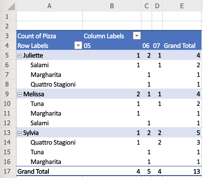
This Pivot Table is sorted by Employee, Pizza and Month.
Is there anything else that could determine the order of inner tables (except for the Employee name)?
Sure it is! Let’s add total counts to every inner table.
| Employee | Pizza / Month | May | June | July | Grand Total |
| Juliette | Margherita | 0 | 1 | 0 | 1 |
| Quattro Stagioni | 0 | 1 | 0 | 1 | |
| Salami | 1 | 0 | 1 | 2 | |
| Tuna | 0 | 0 | 0 | 0 | |
| Total | 1 | 2 | 1 | 4 | |
| Melissa | Margherita | 1 | 0 | 0 | 1 |
| Quattro Stagioni | 0 | 0 | 0 | 0 | |
| Salami | 0 | 1 | 0 | 1 | |
| Tuna | 1 | 0 | 1 | 2 | |
| Total | 2 | 1 | 1 | 4 | |
| Sylvia | Margherita | 0 | 1 | 0 | 1 |
| Quattro Stagioni | 1 | 0 | 2 | 3 | |
| Salami | 0 | 0 | 0 | 0 | |
| Tuna | 0 | 1 | 0 | 1 | |
| Total | 1 | 2 | 2 | 5 | |
| Grand Total | 4 | 5 | 4 | 13 | |
Except for keeping the inner tables order (Pizza name and Month), we have the following options to sort their order:
- Employee name (as we already did, marked in light blue)
- May, June, or July Total sales (value from the Total row in each of the inner tables, marked in light yellow)
- Total sales per each inner table (values from the Total rows and Grand Total column, marked in light green)
We can of course apply the same principle for multiple Column Labels.
Filtering
The last missing piece of the puzzle you often run across when talking about Pivot Tables is filtering.
Filtering is nothing more than just getting rid of some of the data rows (records) from the source table.
Only the values that can pass filters are left in the resulting Pivot Table.
The filters typically compare values against some constant (e.g. Receipt Total < $6.50), or check the value presence in a range or in a list.
It is a bit surprising as filtering actually works with the source data and only changes the input for the Pivot Table. Filters do not change the Pivot Table itself.
It works like this:
Source table rows -> Filters -> Source table values that passed filters -> Pivot Table
Pivot Tables in various tools
So far we were speaking in very general terms with no specific tool in mind. You can use your new knowledge in any tool your company works with – Microsoft Office, Libre Office, Open Office, Google Sheets and many many more…
Let’s have a look at what the Pivot Table settings looks like in the most popular tools so that you are familiar with it and ready to use the tools straight away!
For all the tools, we used the same data about pizza sales as in previous examples.
Our goal is to recreate the complex Pivot Table with pizza sales by Employee, Pizza and Month. This means that the first Row Label is Employee, the second Row Label is Pizza, the Column Label is Month (from the Date and Time column) and the Summation Values are counts.
How do you create a Pivot Table?
In most tools you simply highlight the sheet region and click a function (mostly in Data menu) to create a Pivot Table. You can have a look at an example with Microsoft Office.
In Microsoft Office, there is a function called Ideas that can even suggest some basic Pivot Tables based on what is found on the current sheet. This can be a good start to work with.
Microsoft Office 365
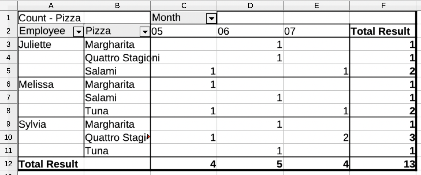
As Excel does not know how to handle date and time naturally, we had to introduce an extra column with the month number.
A function to calculate the month number from the date is not trivial and we are not going to describe the details here.
The result is not very “eye pleasing”, however, it was sufficient to lookup the Pivot Table in the Ideas section and add additional fields.
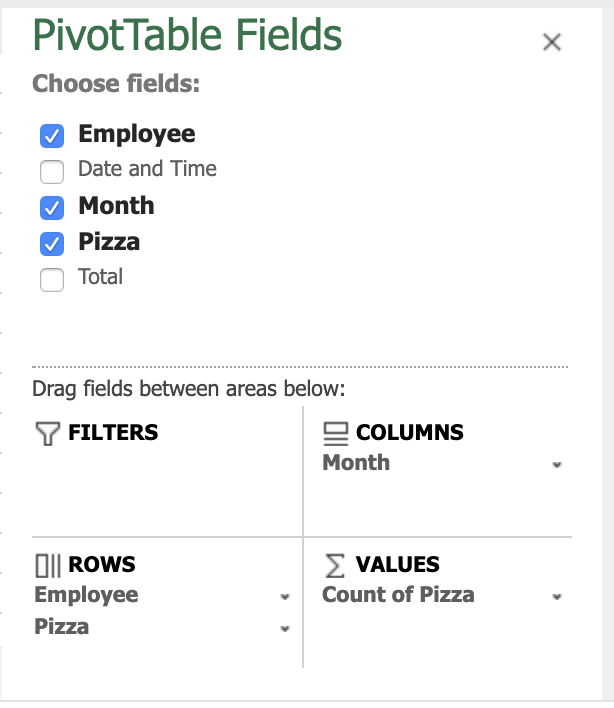
The terminology is pretty much standard – Row Labels are under Rows, Column Labels are under Columns and Summation Values are under Values. The column names are referred to as Fields.
Additional settings like sorting, display values, usage of grand totals etc. are accessible through context menus next to each of the fields.
Other Office versions are mostly the same and use very similar user interfaces (if not exactly the same).
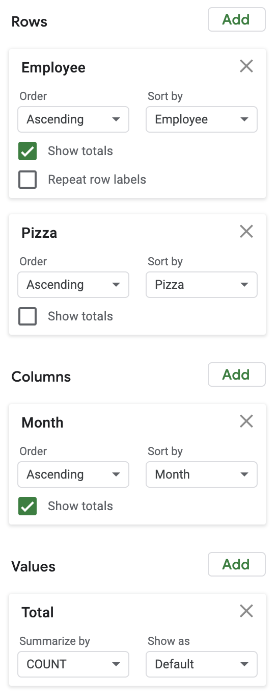
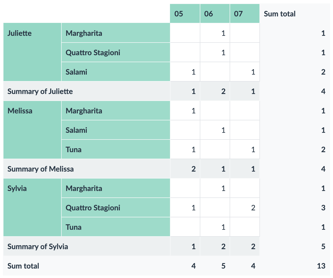
Google Sheets
Google Sheets also cannot parse the date naturally and an additional table column with the Month value was necessary.
However, the output is a bit nicer.
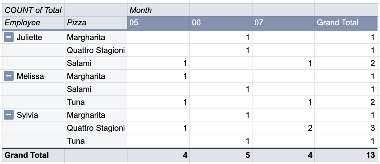
The settings uses the same terms as Microsoft Excel. Row Labels are Rows, Column Labels are Columns and Summation Values are Values.
A very nice feature of Google Sheets are predefined themes that can be switched by a click of a button and the whole Pivot Table can get a different look’n’feel.
LibreOffice Calc
LibreOffice does not understand the date and time field on its own and we again had to create a separate Month column. This is not a big surprise.
The result is very rough. It needs some more manual tweaking to give it some nice look.
The settings of Pivot Table in LibreOffice is the most confusing we have seen and the terminology is definitely different to other tools.
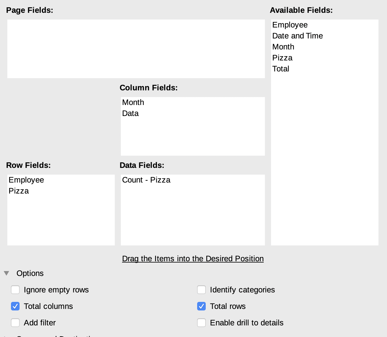
Row Labels are called Row Fields, Column Labels are Column Fields and Summation Values are Data Fields.
More settings of individual fields is sort of hidden — by double clicking on individual fields another dialog is opened with even more settings.
Apple Numbers
Although Apple Numbers is a spreadsheet editor, it does not have any Pivot Table function. There are workarounds to simulate simple Pivot Tables but this cannot be considered a full-fledged table calculator.
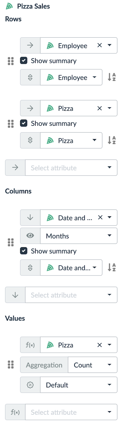
Lumeer
Lumeer is the only tool that naturally understands date and time. This is the first time, we did not need to add a custom Month column.
In Lumeer, every table has its own icon and color and the output look’n’feel respects that configuration.
The terminology used in settings is a standard one — Row Labels are Rows, Column Labels are Columns and Summation Values are Values.
All settings values are immediately visible and easily accessible.
Overall Tool Comparison
In case you were starting with Pivot Tables and you are just looking for the best tool, we added a small comparison. Also because we love data!
| MS Office 365 | Google Sheets | Libre Office | Apple Numbers | Lumeer | |
| Supports all necessary functions | |||||
| Natural understanding of date and time | |||||
| Standardized settings terminology | |||||
| The settings is easily accessible | |||||
| Nice output look’n’feel |
Where to go next?
If you are an Excel fan, you might want to check some interesting articles on Pivot Tables in Excel:
Debra Dalgleish (an owner of Contextures) who is also a Microsoft Most Valuable Professional published a lot of articles on Pivot Tables at her web sites like:
Wen Hsiu Liu leads the Excel! Taiwan group.
Leila Gharani publishes articles on how to use Excel for data analysis and visualisations.
If you are a french native speaker, you might find the site Le CFO masqué by Sophie Marchand useful.
You can also check some online courses at Udemy:
Most of the principles introduced for Excel are valid in other spreadsheet editors.
For Google Sheets, there is a comprehensive Pivot Tables in Google Sheets Beginners Guide by Ben L. Collins.
However, it is important to note that the trends for the future are directed towards self evolving enterprise systems. Such systems demand less and less human intervention and manual work.
From such a point of view, Excel as a data analysis tool might soon be replaced by tools with artificial intelligence that actually understand the data meaning and can shift the way we work.
For more details, you can refer to the Accenture’s Future Ready Enterprise Systems report.
Glossary and Frequently Asked Questions
Here, we address the questions that we frequently face when explaining Pivot Tables in our workshops as well as the basic terms.
Although most tools allow us to use an existing Pivot Table as a source of data for another Pivot Table, we strongly discourage you from this approach.
It is a typical sign of bad data organisation, or bad data structures being used. Or a need to use a tool that can naturally connect multiple tables like Lumeer or a database system with some Business Intelligence tool on top of it.
Yes, all Pivot Tables are refreshed when the source data is changed.
Sometimes we want to make a snapshot — sort of freeze our Pivot Table in time. In such a case, the easiest way to do that is to copy’n’paste the values to another place (sheet, table etc.).
In most tools, comparing two Pivot Tables or merging them together requires a rather manual approach. There are exceptions like Lumeer that can layover multiple Pivot Tables with the same structure.
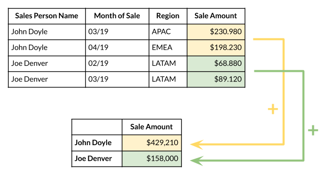
A Row Label (in a Pivot Table) determines a table column that is used to group individual table rows (i.e. records) by the unique values in that specific column. It is called a Row Label as the unique values are listed at the beginning of each row (in the first column) of the resulting Pivot Table.
For example, selecting a Sales Person Name as a Row Label will list all Sales Persons in the first column and next we can group their total sales.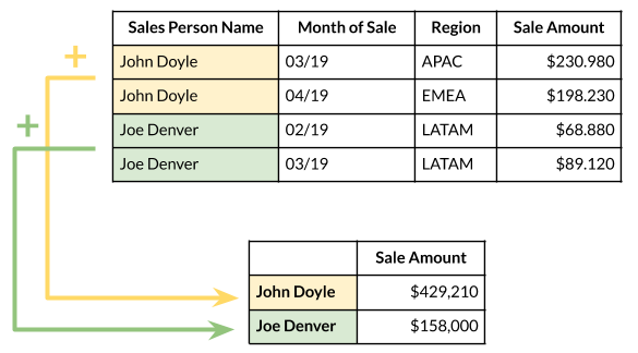
A Column Label (in a Pivot Table) determines a table column that is used to group individual table rows (i.e. records) by the unique values in that specific column. It is called a Column Label as the unique values are listed at the beginning of each column (in the first row) of the resulting Pivot Table.
For example, selecting a Month of Sale as a Column Label will list all Months in the first row and next we can group the total sales.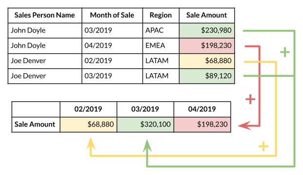
Summation Values are those values from our original table that are used to calculate the resulting value in the Pivot Table.
In addition to the table column that is used to calculate the summation, we must specify a summation function that can combine the values together. It can be a sum, average, minimum, maximum, median etc.
For example, selecting a Sale Amount and sum function will calculate the overall sales for the given Sales Person.