Data Visualization: A Great Partner of Every Project Manager

People retain 80% of what they see, 20% of what they read, and a mere 10% of what they hear. Therefore, data visualization allows us to leave a more profound impression on people than written text. If you can better understand this phenomenon, you’ll have a powerful tool to perform wonders within project management.
Project management is extremely rich in data, such as work reports, capital and operational costs, task lists, calendars, spreadsheets with various market analyses, and even data on current trends. Managers need to acquire this information and be able to manipulate it further, transform it, and ultimately communicate it to target groups.
You probably know this all too well. You spend half a day sifting through a vast amount of data, and in the end, you’re tired, unfocused, and bored. That way, you waste a lot of time, and your work efficiency slowly approaches freezing point. But now, imagine a situation where you could convert these data points into interactive visuals. Can you feel the work efficiency skyrocketing?
The ability to create intelligent visualizations was, until recently, a sought-after advantage for project managers. But now, it has become a necessity. Our decision-making increasingly depends on data that comes to us in such vast quantities that we must adopt at least a basic level of abstraction, like visual abstraction.
Data Visualization in Project Management
Imagine the managers at Boeing – every takeoff and landing generates 1 terabyte of data from sensors placed on the aircraft. Ten landings produce data equivalent to what’s currently housed in the Library of Congress in Washington. Without visualization, it would be nearly impossible for these managers to identify deviations and anomalies in the available data to improve the efficiency of flight landings.
Project management, too, is filled with data visualization designed to transform complex, cluttered data into a simple and effective communication tool. Traditional visualizations, such as Gantt charts, WBS, Kanban boards, business process diagrams, or project calendars, are the most commonly used and serve their purpose quite well, as they provide a detailed picture of the overall project status.
Sponsors and investors, moreover, don’t have time for lengthy weekly reports and briefings. Important decisions need to be made instantly, based on readily available facts. For this reason, traditional project management, reliant on complex processes and many documents, is receding in favor of more agile methods.
Paper-based projects demand a significant amount of time and effort. Information presented in text form is also inefficient. Current research shows that to effectively absorb the presented information, it ideally should be in visual form. The human eye processes visual patterns 60,000 times faster as an image than a table. And 90% of all information we absorb is visual.
These facts have led to the emergence of visual project management, which focuses on improving project communication and overall collaboration, as well as better anticipation of work processes and procedures.
Main Benefits of Data Visualization
The primary benefit of this new approach is clear – speed. Critical project information must be produced, replicated, and communicated more efficiently. Other advantages include:
- Project planning and tracking of individual processes, execution, monitoring, and control activities are available in a simple and clear format that’s easy to understand.
- It enhances clarity, transparency, and understanding of the overall framework of the given project.
- Increases transparency when allocating resources to one or more projects.
- In real-time, you can track changes in planning, priorities, or the allocation of individual resources.
- Information is presented in a form that’s easily understandable and memorable for everyone.
Thanks to the ubiquitous internet and the progressive growth of the market in high-quality and easily accessible tools, visualization is also available to everyone at minimal cost.
What does Lumeer say about this?
Data visualization in project management can improve not just one business, primarily because everyone clearly understands their role and responsibility. Instead of endlessly searching through emails, piecing together bits of information about the current task, and tracking project updates via “whisper down the lane,” teams can simplify their daily operations.
Development diagrams, timelines, visual planning boards, and other most commonly used project tools can assist them.
Depending on the type of project, project managers can opt for one or a combination of multiple methods or tools. Dive into the mysterious depths of visual communication with three basic project tools, ensuring that you’ve delivered the assigned project on time, cost-effectively, and with a quality that meets your and your client’s standards.
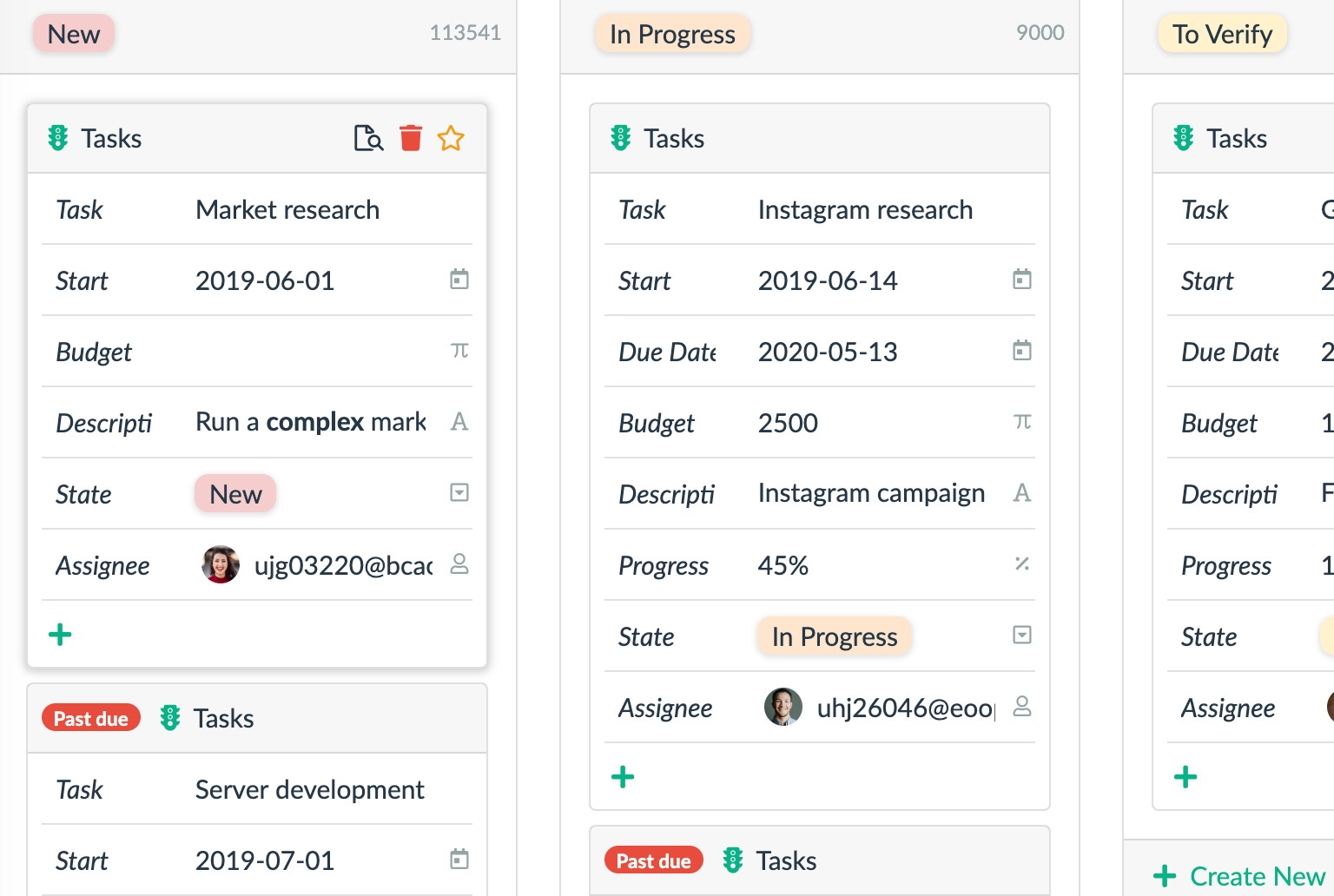
Kanban Board
The Kanban board is a tool primarily designed for visualizing assigned and ongoing tasks. Traditionally, you can track various stages using cards, with which you create columns (representing individual phases) and rows (depicting assigned tasks). For example, you can categorize tasks into “Done”, “In Progress”, or “Planned”. The Kanban methodology operates based on the management and monitoring of work-in-progress projects.
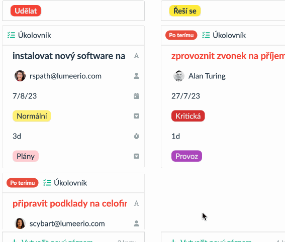
Its best use is data visualization is currently for projects that contain a series of smaller, mutually similar tasks. In such a case, it could be about writing individual articles that are subsequently combined into one larger piece. It allows you to visualize where each of the individual tasks is and flexibly adjust and move them as it suits you. Print editors, salespeople, or software developers will certainly find that the Kanban system works wonderfully for them.
Pros
- Kanban is simple to understand and implement.
- It offers immense flexibility because, with Kanban, you don’t have to set rules, roles, or any methodology.
- Boards can be adjusted anywhere and at any stage. Therefore, it’s suitable for longer-term projects where team members can add new sub-tasks at any time.
Cons
- Kanban can become quite cluttered if they contain too many tasks. Working with a pre-agreed maximum number of tasks can be worked on simultaneously is recommended.
- Flexibility can also hinder and ultimately harm the desired goal – mainly because tasks are not strictly time-bound.
Scrum
Scrum differs from Kanban in that Scrum tracks project progress in so-called sprints. A sprint is essentially a period that is long enough for individual tasks to be completed but at the same time short enough to work on only one or a very limited number of projects. The goal is to complete the task within a predetermined time frame. A so-called scrum master then monitors this process.
Scrum is most beneficial for data visualization when your goal is to deliver a product. It excels, especially in evenly focusing the energies of the entire team within a fixed period. It’s particularly useful if you’re running a software company, planning events, filming movies, or designing interiors.
Pros
- Scrum enhances the performance of the entire team.
- Scrum is based on, for example, sprinting over two weeks. During this period, you exert tremendous energy and stimuli, as you can concentrate better and thus increase your productivity.
- With Scrum, you can create reports for each sprint, allowing your team to improve and learn from its mistakes gradually.
Cons
- Scrum has many specifics – mastering it requires good skills, abilities, and appropriate training. So, don’t be surprised if people unfamiliar with it initially struggle.
- Scrum is much less flexible – you can’t start adding new tasks in the middle of a sprint, and every team member is compelled to complete their task within the given time frame.
Check out a more detailed article on both Scrum and Kanban.
Gantt Chart
With the help of Gantt, you can visually illustrate a project plan with marked deadlines, milestone dates, and even the interdependence between various tasks. Fundamentally, you must identify key tasks in a given project, indicate their mutual efforts, and ultimately monitor the ongoing progress.
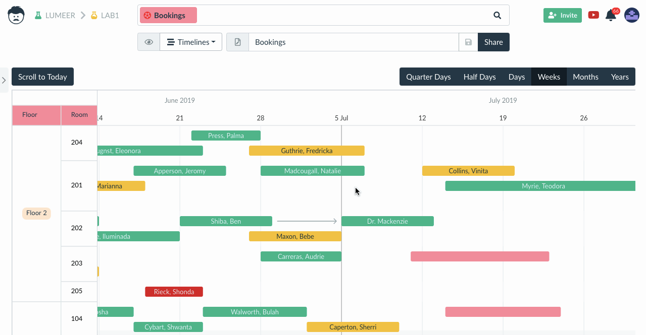
You’ll find the best use of data visualization in the Gantt chart if you’re an engineering firm, a film studio, or running a political campaign. It’s popular mainly because it can visualize a series of concurrently ongoing tasks that are interdependent, and to achieve the goal, it’s necessary to consider all of them. It excellently illustrates complex projects with overlapping deadlines and significantly improves time management.
Pros
- You can easily set time frames for individual projects. You’ll get a good idea of when the project will be completed and what needs further work.
- Team members and leaders see the relationships and dependencies between individual tasks, thus better managing set deadlines.
Cons
- For proper functioning, you must set where, when, and by whom a particular task will be processed, its dependence on other tasks, and possibly who is working on the others. Keeping track of individual parts can therefore become significantly complicated. Moreover, without the right tools, timelines are harder to create.
- Tasks are interdependent, making Gantt very rigid and inflexible.
Advantages of Visual Project Management
It saves time for both you and your colleagues. It’s easily understandable. It improves communication in the workplace. And it increases transparency.
According to Scientific American, we are experiencing a data visualization revolution. And it’s no surprise. Project managers encounter a vast amount of data daily, which needs to be appropriately sifted through and understood.
However, this doesn’t mean that the project manager is alone in this task – the secret to success lies in teamwork. Teams capable of effectively communicating and collaborating have a significant advantage over their counterparts.
Visual project management is one method that facilitates mutual interaction, a better understanding of roles, and higher-quality adherence to set deadlines.
Are you a revolutionary or an advocate of old ways? Invest in a quality tool and participate in a revolution that might not change the world but will certainly change how you handle your projects.